Quick, picture in your mind what the members of Chicago look like. OK, maybe you’re a Robert Lamm fan or grooved to Peter Cetera’s hit ballads, but odds are that nobody comes immediately to mind. Now picture what Chicago’s logo looks like. Probably took all of a split-second to think of that famous, Coca-Cola-inspired script. That’s just one example of how great band logos can embody the very essence of a group.
Band logos weren’t always cool
During the 60s, band logos weren’t always cool. Bands were artists, not products, and their look, as well as their music, was supposed to evolve with each new album. As usual, The Beatles set the tone. The design of their albums was wildly different every time, and on Rubber Soul, they were probably the first major band to keep their name off the front of a new album altogether. However, The Beatles had a rather spiffy logo – the famous one with the drop-T, as seen on Ringo’s bass drum – but it never appeared on an album until the release of the Past Masters collections, long after the group’s break-up.
Likewise, The Who had that iconic Mod image of their name encircled with an arrow, but it only appeared on one album – on the back of Jimmy’s Quadrophenia jacket. The Rolling Stones waited until 1971 to unveil their perfectly iconic tongue-and-lips logo – though, in fact, Mick Jagger’s tongue and lips were iconic long before any art designers went at them. Technically, it was the logo of Rolling Stones Records, not the band itself, but nowadays they’re inseparable, especially since the last Stones album, Blue & Lonesome, built its artwork around it. The Beach Boys didn’t get a logo until 1976 (on the album 15 Big Ones), and they kept theirs in the family. The designer of their neon-sign like logo was Dean Torrence, of former surfin’ rivals Jan & Dean.
Even the most recognizable 60s logo of them all – the guitar-shaped one belonging to The Monkees – only appeared on three of the group’s original eight albums (plus a host of reissues and reunions). When they last used the logo on a record, 1967’s Pisces, Aquarius, Capricorn & Jones Ltd, they obscured it in a field of flowers, as if they were burying the past and moving on.
Interestingly, two of the other 60s groups with recognizable band logos both recorded for the same label. The Doors had those open block letters that suggested open possibilities – a perfect call for that band – and were perhaps the first group to use their logo on their record label. Their Elektra labelmates, Love, rendered their name in a DayGlo script that looked like it had spilled out of a lava lamp, which leader Arthur Lee even used a variation of on his solo albums.
Chicago put band logos on the map
But for better or worse, it was Chicago (and designer John Berg) who really put band logos on the map. Cynics have said that Chicago’s logo smacks of corporate branding, or that it emphasizes the faceless nature of the band, but they’re missing the point. Those Chicago covers denote class and continuity, being part of a matching set. And the sheer cleverness of those designs – with the logo carved in wood, tooled in leather or stamped in chocolate – kept fans guessing between albums. The cleverest one of all appeared on their 13th album, where it became a high-rise building. Through their long history of personnel changes, Chicago have at least been loyal to the logo. They’ve hidden it in the background once or twice, but it’s there on every album.
In the iconic stakes, right behind Chicago’s logo is Roger Dean’s trademark Yes logo, which first appeared on Close To The Edge (Dean’s second cover for Yes, and their fifth album). Dean’s florid treatment of those three letters came to symbolize the prog-diehard side of Yes. When they went for a streamlined sound in the 80s the logo was gone, and when they returned to their prog roots on 1997’s Keys To Ascension, it was back.
The golden age for band logos
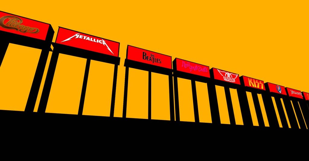
The 70s became a golden age for band logos, whether it was Aerosmith’s fancy winged script, New York Dolls’ name appropriately scrawled in lipstick, or Ramones’ baseball bat-wielding eagle, an outgrowth of their love for comic-book art. KISS stirred controversy with their logo, swearing for decades that the resemblance to the Nazi SS was accidental. Also accidental is that the two S’s aren’t quite parallel – a bit of human error that came in when Paul Stanley originally drew it.
Rush had their 2112-era graphic of the man staring into the pentagram; created by designer Hugh Syme, the “Starman” logo has become a part of Rush iconography even as the look of their graphics changed with each new musical phase. Not to mention Grateful Dead’s famous skull-and-lightning logo, which first appeared in 1969 and was co-designed (with Bob Thomas) by the now-legendary Owsley “Bear” Stanley III. This was Owlsley’s most visible contribution to the Dead, but far from the only one. He was also the engineer who built their ahead-of-its time sound system, and the chemist who supplied the Dead (and anyone else in his good graces) with the most potent LSD to be found anywhere.
Metal took logos to new heights
But it was metal bands that took logo design to new heights – or depths, given their love for horror-inspired, underworld themes. No self-respecting headbangers would be without a badass logo. Sometimes they just rendered their name in a fearsome script, like Metallica with their lightning-like lettering. Others came up with a literal interpretation of their band name, like the Slash-designed logo for Guns N’ Roses. But some bands took on a full-fledged mascot, most famously Iron Maiden’s zombie buddy Eddie.
Originally created by their light man Dave Beasley, Eddie’s not only been a fixture on their album covers, he’s turned up at their shows – originally as a model head, but more lately joining them in the flesh. Not to be outdone, Megadeth got their own zombie pal, the skull-headed Vic Rattlehead, conceived by leader Dave Mustaine. Motörhead, of course, had the most fearsome mascot of all. Their horned and helmeted creature was a caricature of Lemmy himself – and it doesn’t get more metal than that.